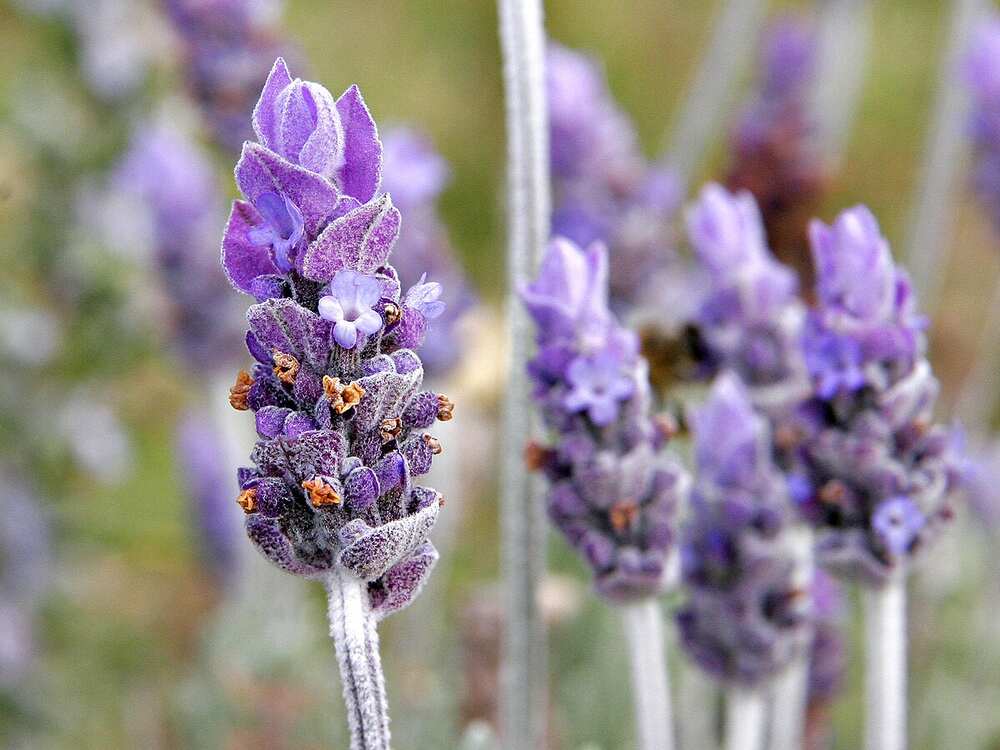
Lavender, a shade that is both serene and sophisticated, evokes a sense of calm and elegance that few other colors can match. This gentle hue, with its delicate blend of blue and red, sits gracefully between purple and pink on the color spectrum. Often associated with the fragrant flower of the same name, lavender has transcended its botanical roots to become a symbol of tranquility, luxury, and timeless beauty in art, design, fashion, and even psychology. In this article, we will embark on a color journey through the various shades of lavender, exploring its history, symbolism, and applications, while also uncovering the reasons behind its enduring appeal.
The Origin and Evolution of Lavender as a Color
The word “lavender” originally referred to the flower of the Lavandula species, which has been cherished for centuries for its soothing fragrance and medicinal properties. The term eventually extended to the pale purple color of the blooms, and by the late 19th century, “lavender” was officially recognized as a color in the English language.
Historical Significance of Lavender
Lavender as a color has a rich history intertwined with culture, fashion, and even politics. In ancient times, the lavender plant was highly prized for its aromatic oils, which were used in perfumes, soaps, and medicinal remedies. The color lavender, being derived from this valued plant, was often associated with nobility, luxury, and exclusivity.
During the Victorian era, lavender became a popular color for women’s clothing and accessories, symbolizing refinement and grace. Queen Victoria herself was known to favor lavender, further cementing its status as a color of high society. As time progressed, lavender also became associated with mourning and remembrance, especially in the form of lavender-hued garments worn by widows in the late 19th and early 20th centuries.
In the 20th century, lavender took on additional meanings, particularly in the LGBTQ+ community, where it became a symbol of empowerment and resistance. The color’s association with the LGBTQ+ movement added a layer of depth to its significance, transforming it into a symbol of pride and identity.
Lavender in Modern Times
Today, lavender continues to be a popular color in various domains, from fashion and interior design to branding and digital media. Its versatility allows it to be both soothing and stimulating, making it a favorite choice for creating atmospheres that are both relaxing and visually appealing.
In fashion, lavender is often seen in spring and summer collections, where its light, airy quality reflects the freshness of the season. In interior design, lavender is used to create serene and peaceful spaces, often in bedrooms, nurseries, and living areas. Brands, too, have embraced lavender for its ability to convey sophistication and calm, making it a popular choice in packaging, logos, and marketing materials.
Exploring the Shades of Lavender
Lavender is not a monolithic color; it encompasses a spectrum of shades, each with its own unique character and appeal. From soft, pastel tints to deeper, more saturated tones, the variations of lavender offer a wide range of possibilities for creative expression.
Pastel Lavender
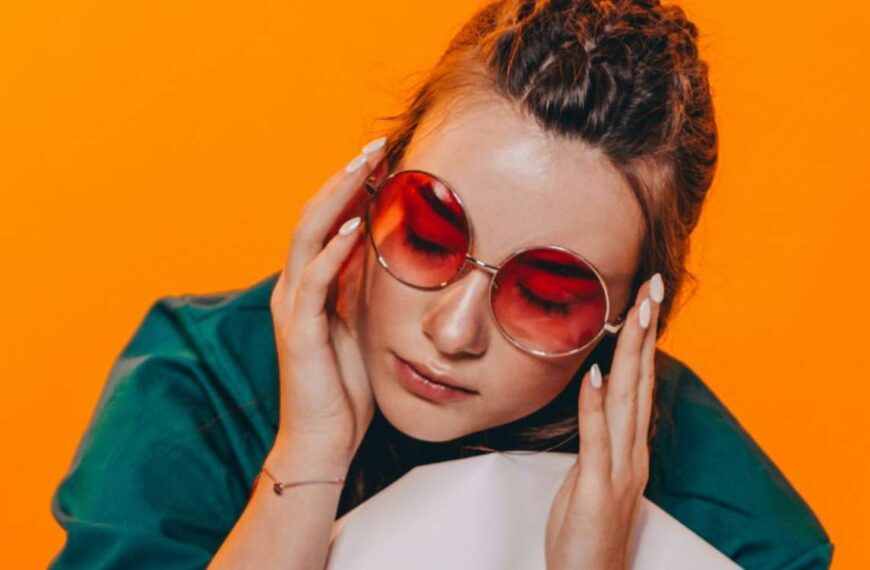
Pastel lavender is the lightest and softest shade in the lavender family. It is a delicate, almost ethereal color that is often associated with innocence, purity, and femininity. This shade is ideal for creating a sense of calm and tranquility, making it a popular choice for baby nurseries, weddings, and spa environments.
In fashion, pastel lavender is often used in spring collections, where its lightness complements the freshness of the season. It pairs beautifully with other pastels like mint green, baby blue, and blush pink, creating a soft and harmonious palette. In interior design, pastel lavender can be used to add a touch of elegance to spaces, often as an accent color in soft furnishings, wall paint, or decorative accessories.
Lavender Blue
Lavender blue is a shade that leans more towards the blue side of the spectrum, giving it a cooler and slightly more subdued feel compared to traditional lavender. This shade evokes a sense of calm and serenity, making it an excellent choice for spaces where relaxation and reflection are key.
In design, lavender blue is often used to create a serene and sophisticated atmosphere, especially in bedrooms, bathrooms, and living areas. It pairs well with whites, grays, and other cool tones, as well as with metallic accents like silver and chrome, which can add a touch of modernity and elegance to the space.
In fashion, lavender blue is a versatile color that can be worn year-round. It works particularly well in formal and professional settings, where its cool, composed nature conveys a sense of confidence and poise. Lavender blue is also a popular choice for bridesmaid dresses and wedding decor, where its understated elegance can enhance the overall aesthetic of the event.
Dusty Lavender
Dusty lavender is a muted, sophisticated shade that combines lavender with a touch of gray or beige. This color has a vintage, timeless appeal, making it a popular choice for those who appreciate a more understated and refined aesthetic.
Dusty lavender is often used in interior design to create a warm, inviting atmosphere. It works particularly well in living rooms, dining areas, and bedrooms, where its muted tones can add depth and character without overwhelming the space. Pairing dusty lavender with earthy neutrals, such as taupe, ivory, and soft browns, can create a harmonious and cohesive color scheme that exudes warmth and comfort.
In fashion, dusty lavender is a favorite for fall and winter collections, where its richness and depth make it an excellent alternative to more traditional autumnal colors like burgundy, olive, and mustard. It can be worn in both casual and formal settings, offering a sophisticated and versatile option for a variety of occasions.
Deep Lavender
Deep lavender, sometimes referred to as lavender purple, is a richer, more saturated shade that brings a sense of drama and intensity to the color palette. This shade is bold and vibrant, making it a striking choice for those who want to make a statement.
In design, deep lavender can be used to create a luxurious and opulent atmosphere, especially when paired with rich textures like velvet, silk, and brocade. It works well in spaces where a touch of drama is desired, such as dining rooms, lounges, and home theaters. When combined with metallics like gold or bronze, deep lavender can evoke a sense of old-world glamour and sophistication.
In fashion, deep lavender is often seen in evening wear and formal attire, where its boldness can create a stunning visual impact. It is a popular choice for gowns, suits, and accessories, particularly during the fall and winter seasons. Deep lavender also pairs beautifully with jewel tones like emerald, sapphire, and ruby, creating a rich and regal color palette that is perfect for special occasions.
The Psychological Impact of Lavender
Lavender, like all colors, has a psychological impact that goes beyond its aesthetic appeal. The color lavender is often associated with calm, relaxation, and spiritual well-being, making it a popular choice in environments designed to promote healing and tranquility.
Lavender and Calmness
One of the primary associations with lavender is its ability to soothe and calm the mind. This connection likely stems from the lavender plant’s use in aromatherapy, where its scent is known to reduce anxiety and promote relaxation. In color psychology, lavender is believed to have similar effects, helping to create a peaceful and serene environment.
Lavender’s calming properties make it an excellent choice for spaces where relaxation is a priority, such as bedrooms, meditation rooms, and spas. The color can help reduce stress and anxiety, promoting a sense of well-being and balance.
Lavender and Creativity
While lavender is primarily associated with calmness, it is also linked to creativity and inspiration. The color’s balance between blue and red, both of which are powerful colors in their own right, gives lavender a unique ability to stimulate the mind while maintaining a sense of calm.
This makes lavender an excellent choice for creative spaces, such as art studios, offices, and study areas. The color can help foster a productive and imaginative atmosphere, encouraging creative thinking while keeping stress at bay.
Lavender and Spirituality
Lavender is also associated with spirituality and higher consciousness. In many cultures, the color purple (and by extension, lavender) is linked to the crown chakra, which is believed to be the center of spiritual connection and enlightenment. Lavender’s light, airy quality enhances this association, making it a popular choice in spaces designed for meditation, prayer, and spiritual practices.
In spiritual contexts, lavender is often used in combination with other calming colors like white, soft blue, and pale pink, creating a serene and harmonious environment that supports introspection and inner peace.
Conclusion: Embracing the Versatility of Lavender
Lavender is more than just a color; it’s a journey through history, culture, and psychology. Its various shades offer endless possibilities for creative expression, whether you’re designing a space, choosing an outfit, or simply exploring the emotional impact of color. From its calming properties to its sophisticated elegance, lavender has something to offer everyone. By understanding and embracing the versatility of lavender, you can harness its unique qualities to enhance your surroundings and enrich your life.
As you continue your exploration of color, remember that lavender is not just a single shade but a spectrum of possibilities, each with its own story to tell. Whether you’re drawn to the soft pastels or the deep, rich tones, there is a shade of lavender that can capture your imagination and bring your vision to life.
Also Read Interesting articles at Amazing Posting
 By
By
 By
By